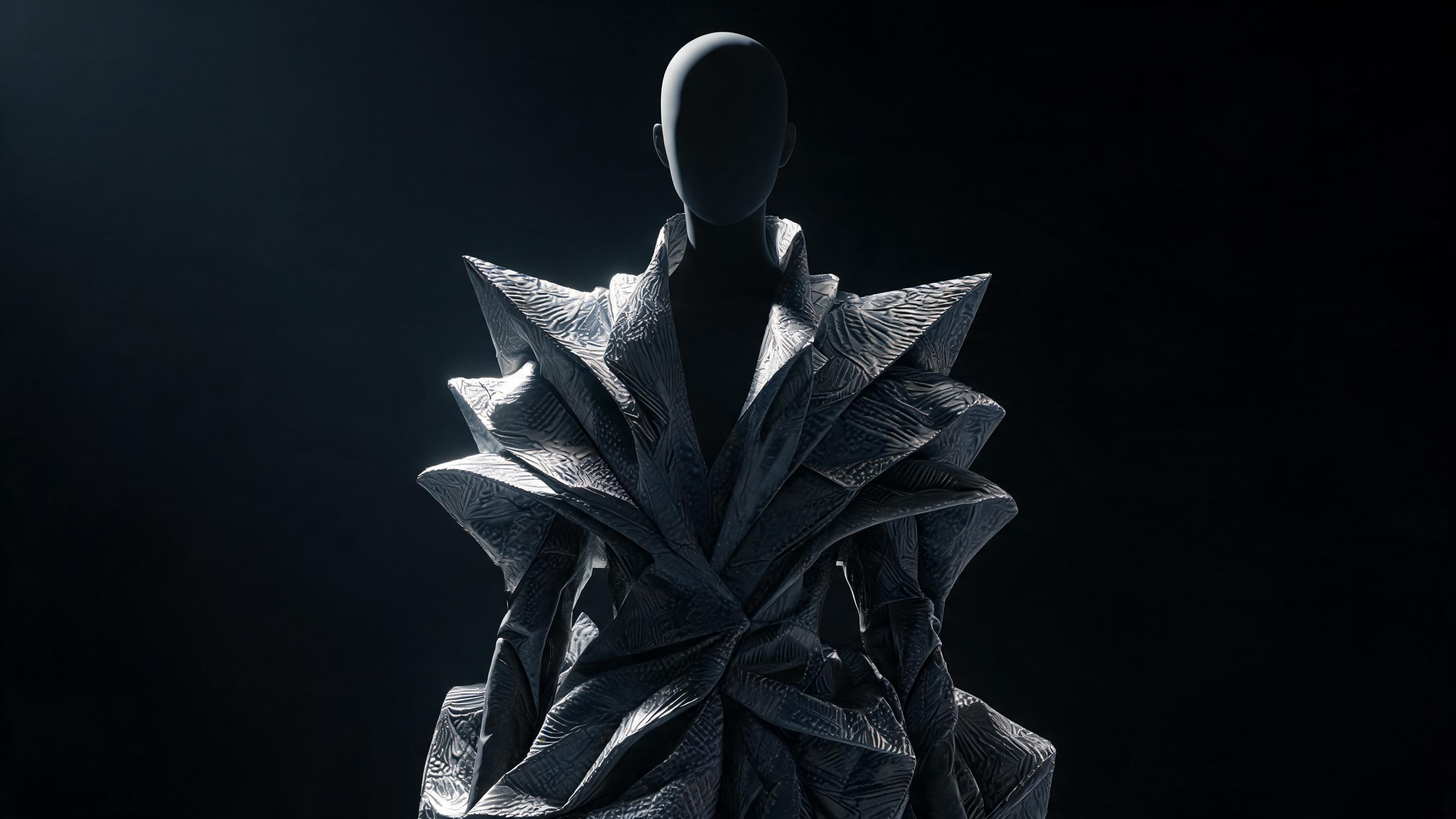
How to Control Color Palettes in Demna AI Fashion Designs

Learn to steer Demna AI’s visual language with deliberate hues, contrast, saturation, and mood-driven palette prompts for more cohesive fashion concepts.
Demna AI color palette control is the use of explicit color instructions, reference swatches, and palette constraints to direct the colors generated in Demna AI fashion designs. A controlled palette typically specifies 3–5 core colors using names or HEX values, along with their roles—such as base, accent, trim, and background—to improve consistency across designs. Consistent wording, fixed swatches, and negative prompts that exclude unwanted colors provide the most reliable control.
AI color palette control in Demna AI fashion designs means defining, constraining, and validating color relationships so generated garments follow a deliberate visual system instead of drifting toward generic or unintended hues.
Key Takeaway: Demna AI color palette control lets designers define, constrain, and validate color relationships so generated garments maintain a deliberate visual system rather than drifting toward unintended or generic hues.
Why Does Demna AI Color Palette Control Matter?
Color is not a finishing detail in fashion design. It changes how a garment is perceived, how its construction reads, how a silhouette appears on the body, and whether a collection feels coherent across multiple designs.
Demna AI can generate visually convincing fashion concepts, but a strong image is not automatically a controlled design. If the prompt says “dark red coat,” the output may introduce burgundy panels, orange highlights, black shadows, cool gray hardware, and background colors that compete with the garment. The result can look polished while failing the actual design brief.
Demna AI color palette control: the structured process of specifying dominant, supporting, accent, neutral, and background colors in a fashion-generation workflow, then checking whether the output preserves those relationships.
Color control matters for five reasons:
- Design continuity: Multiple garments need to look like they belong to the same collection.
- Material readability: Wool, leather, satin, denim, and technical nylon reflect color differently.
- Silhouette clarity: High contrast can emphasize seams, volume, and layering; low contrast can merge them.
- Production communication: A controlled palette translates more clearly into swatches, tech packs, and vector artwork.
- Personal style alignment: A personal style model needs stable color preferences, not isolated image impressions.
The central mistake is treating color as a list of adjectives. “Minimal black and red” is not a complete color system. A usable system assigns each color a role, location, intensity, and relationship to the others.
What Should You Define Before Using Demna AI?
Before generating a design, convert the visual idea into a color specification. This prevents the model from making too many independent decisions.
Start with five variables:
| Variable | What it controls | Example |
|---|---|---|
| Dominant color | The main visual identity of the garment | Charcoal black |
| Secondary color | Panels, layers, or structural contrast | Oxidized olive |
| Accent color | Small areas that attract attention | Signal red |
| Material variation | How the same hue changes across fabrics | Matte charcoal wool, glossy charcoal nylon |
| Background color | Separation between garment and setting | Warm off-white |
A practical palette should also define where each color appears. “Olive details” is weaker than “olive used only on the right sleeve panel, pocket flap, and lower hem binding.”
Build a Color Role Map
Use a role map before writing the prompt:
- Primary: the color covering most of the garment.
- Secondary: a supporting color covering panels, layers, or coordinated pieces.
- Accent: a concentrated color reserved for small details.
- Neutral: a balancing color used for lining, fasteners, stitching, or footwear.
- Environment: the background, floor, lighting, and surrounding surfaces.
This hierarchy gives Demna AI a structure to preserve. It also makes the output easier to evaluate. If the accent color spreads across half the garment, the issue is no longer subjective; the model has violated the role map.
Separate Garment Color from Lighting Color
Warm lighting can make gray look beige. Blue lighting can make black look navy. Colored backgrounds can reflect onto glossy materials and create false palette readings.
Specify lighting separately:
- Garment colors: matte black, muted olive, controlled red accent.
- Lighting: neutral daylight, low saturation, no colored spotlight.
- Background: pale warm gray, visually distinct from the garment.
This distinction is essential when you intend to compare multiple designs. You can read more about maintaining visual consistency across generated variations in How Demna AI Compares Different Versions of a Fashion Design.
How Do You Build a Palette for Demna AI?
A controlled palette begins with a limited set of roles rather than a long list of color names.
Choose the Dominant Color
Select one dominant color that defines the garment’s first impression. Name the color by hue, value, saturation, and material when possible.
Compare these descriptions:
- “Black coat”
- “Deep neutral black, low saturation, matte wool surface”
- “Soft black with charcoal variation, no blue cast, matte wool body”
The third description gives the model more usable constraints. It establishes the expected temperature and surface behavior without introducing unnecessary complexity.
For a dark garment, specify whether the design should remain visually black under lighting. Otherwise, highlights can turn black into navy, graphite, or gray.
Select One or Two Supporting Colors
Supporting colors should clarify construction, not compete with the dominant color. Use them for:
- Side panels
- Sleeves
- Collars
- Underlayers
- Pocket structures
- Ribbing
- Binding
- Hardware zones
A useful approach is to select supporting colors with a defined relationship to the dominant color:
- Monochromatic: black, charcoal, graphite
- Analogous: olive, moss, muted yellow-green
- Complementary: dark blue with rust orange
- Split complementary: violet with muted yellow and blue-green
- Neutral contrast: black with bone white
- Temperature contrast: cool gray with warm brown
Avoid naming too many relationships at once. A palette can be technically harmonious and still become visually unstable if every relationship appears in the same garment.
Reserve the Accent Color
Accent colors work only when they remain scarce. Define both the hue and the maximum placement.
For example:
“Use signal red only for the zipper pull, inner collar edge, and a narrow 5-millimeter topstitch detail; do not use red on the main body, sleeves, background, or footwear.”
The exact measurement is less important than the principle: the accent needs a boundary. If you want a broader visual effect, use a percentage of garment area as a design target, but treat it as a planning estimate rather than a guaranteed pixel measurement.
Define the Neutral System
Neutrals often control whether a palette appears severe, soft, industrial, or luxurious. Specify:
- Warm or cool undertone
- Matte or reflective finish
- Whether the neutral belongs to the garment or environment
- Whether it should appear as a flat block or tonal variation
Useful neutral descriptors include:
- Bone white instead of bright white
- Warm stone instead of beige
- Blue-black instead of generic black
- Ash gray instead of silver
- Dark espresso instead of brown
If the palette includes white, decide whether it should be optical white, cream, bone, chalk, or gray-white. These distinctions affect contrast and perceived material quality.
How Do You Write a Demna AI Color Prompt?
A reliable prompt follows the order in which design decisions should be made.
Use a Layered Prompt Structure
Write the prompt in this sequence:
- Garment type and silhouette
- Primary color and material
- Secondary colors and exact placement
- Accent color and limits
- Garment details
- Model or body proportions
- Lighting and background
- Exclusions and failure conditions
Example:
Oversized double-breasted wool coat with dropped shoulders, long straight silhouette, and structured peak lapels. Dominant color: deep neutral black in matte wool, with subtle charcoal tonal variation. Secondary color: muted oxidized olive only on the under-collar, sleeve tabs, and lower side panels.
Accent color: signal red limited to the zipper pull, inner collar edge, and narrow topstitching. Black leather gloves and black low-profile boots. Neutral daylight, pale warm-gray background, no colored reflections, no additional hues, no red panels, no bright white, no gradient color blocking.
This format separates the visual system from the object description. It reduces the chance that color terms become decorative noise.
State What Must Not Happen
Negative constraints are particularly useful for palette control. Include specific exclusions:
- No additional accent colors
- No rainbow effect
- No neon saturation
- No color gradient
- No random color blocking
- No colored background
- No blue cast in black materials
- No white logos
- No contrasting footwear unless specified
- No color transfer from background to garment
Avoid vague exclusions such as “make it tasteful.” Taste is not an operational constraint. “Use no more than three garment hues” is more actionable.
Keep Color Instructions Near Related Materials
A model may lose track of color assignments when the prompt separates color from construction by several sentences. Tie each color to its object:
- “Matte charcoal wool body”
- “Black leather welt pockets”
- “Muted olive nylon sleeve inserts”
- “Signal red metal zipper pull”
This is stronger than listing all colors at the beginning and materials at the end.
Use Color Names with Descriptors
Basic color names are often ambiguous. Pair them with descriptors:
| Weak instruction | Stronger instruction |
|---|---|
| Red | Deep signal red, high chroma, limited to hardware |
| Green | Muted olive with a yellow undertone |
| White | Warm bone white, matte surface |
| Gray | Mid-value ash gray, neutral undertone |
| Blue | Deep navy, low saturation, no purple cast |
| Brown | Dark espresso brown, cool undertone |
| Pink | Dusty rose, low saturation, matte fabric |
Do not over-specify every color with technical notation unless your workflow supports it consistently. A long list of color codes can create false precision if the generation system does not preserve exact values.
👗 Want authenticated, AI-curated fashion? Shop with Alvin's Club →
What Are the Main Steps for Controlling Color Palettes in Demna AI?
Use the following sequence for a repeatable workflow.
Define the Design Objective — Write one sentence describing the garment, intended mood, silhouette, and use case. Example: “A protective oversized commuter coat that feels severe, technical, and quiet.” This prevents color decisions from becoming detached from function.
Assign Color Roles — Choose one dominant color, one or two supporting colors, one accent, and a neutral system. Record where each color appears and where it cannot appear.
Specify Material Behavior — State whether each color belongs to wool, leather, nylon, denim, satin, metal, or another surface. Add matte, brushed, polished, coated, translucent, or reflective behavior where relevant.
Set Proportions and Placement — Describe whether each color covers the full garment, a panel, a trim, an underlayer, or hardware. Use boundaries such as “only,” “limited to,” “along,” and “inside.”
Write the Generation Prompt — Combine garment structure, palette hierarchy, placement, lighting, background, and negative constraints in a fixed order.
Generate a Controlled Baseline — Create a first image with minimal variables. Do not change silhouette, styling, camera angle, palette, and material simultaneously.
Inspect Palette Drift — Check whether hues, saturation, value, material reflections, background, and accessories remain within the brief. Identify the exact failure rather than calling the image “off.”
Revise One Variable at a Time — Change only the problematic instruction. If red spreads too far, revise red placement; do not also change the coat shape and lighting.
Compare Variants Systematically — Place outputs beside one another and evaluate dominant color, secondary color, accent area, material behavior, and background consistency.
Lock the Approved Palette — Create a reusable palette record containing color names, roles, placements, exclusions, and reference images. Use the same record across future designs.
Prepare the Output for Design Development — Preserve the approved image, prompt, palette map, and version notes. If vector or technical refinement is required, follow the workflow described in How to Use Demna AI’s Vector Output for Fashion Design.
How Should You Control Palette Proportions?
Color proportion is the relationship between visual area, contrast, and attention. A small bright accent can dominate a large muted field because saturation attracts the eye more strongly than area alone.
Use three controls:
Area
Area describes how much of the garment carries a color.
- Dominant color: main body and largest structural surfaces
- Secondary color: panels, inserts, or coordinated layers
- Accent: narrow details and hardware
- Neutral: balancing surfaces and accessories
A dark coat with a bright red pocket panel does not have a “small red accent,” even if the panel is physically smaller than the body. Its contrast gives it high visual weight.
Value
Value describes lightness or darkness. Two colors can have different hues but similar values, causing them to merge. Conversely, a small value contrast can make a seam or pocket immediately visible.
For silhouette-focused designs:
- Use close values when you want construction to recede.
- Use moderate value contrast when you want panels and layers to read clearly.
- Use strong value contrast when the design depends on graphic blocking.
Saturation
Saturation describes intensity. A muted olive and a saturated emerald are not interchangeable, even if they occupy the same hue family.
High saturation is useful for:
- Safety details
- Hardware
- Branding
- Small functional indicators
- A deliberate focal point
High saturation is risky when applied to:
- Large outerwear panels
- Backgrounds
- Multiple garment zones
- Both clothing and accessories
A Practical Palette Matrix
Use a matrix to evaluate whether each color has a clear job:
| Color | Value | Saturation | Material | Placement | Visual role |
|---|---|---|---|---|---|
| Neutral black | Low | Low | Matte wool | Main body | Dominant |
| Charcoal | Low-mid | Low | Brushed cotton | Side panels | Tonal structure |
| Oxidized olive | Mid-low | Low-mid | Coated nylon | Sleeve inserts | Secondary |
| Signal red | Mid-high | High | Painted metal | Zipper pull | Accent |
| Warm gray | Mid | Low | Background paper | Environment | Separation |
This matrix is more useful than a simple list of hex values because it captures how the colors behave in context.
How Do Materials Change Color in AI-Generated Fashion?
A generated image does not display color independently of surface. Material determines how highlights, shadows, folds, and reflections modify the apparent hue.
Wool
Wool usually reads as diffuse and soft. Its color appears stable across folds, but heavy texture can reduce saturation. Use descriptors such as:
- Matte
- Dry hand
- Brushed
- Dense weave
- Soft shadow transitions
A black wool coat should not look like black patent leather. If it does, the prompt needs stronger material separation.
Leather
Leather can shift color across curved surfaces because of gloss and reflection. Specify:
- Aniline or coated appearance
- Low, medium, or high sheen
- Smooth or pebbled grain
- Whether highlights should remain neutral
A brown leather panel may produce orange highlights under warm lighting. If the color must remain dark espresso, state “cool undertone, controlled neutral highlights.”
Nylon and Technical Fabrics
Nylon often introduces sheen, edge highlights, and color gradients. For controlled palettes, specify:
- Low-sheen or matte technical nylon
- No iridescence
- No rainbow reflection
- Stable color under neutral light
Words such as “technical” alone do not control surface behavior. Technical fabric can mean anything from matte ripstop to reflective coated shell.
Satin
Satin creates large highlight bands that can dominate the image. If the palette depends on a precise color, specify the direction and intensity of the sheen:
“Muted burgundy satin with restrained directional highlights; no white-hot reflections and no color shift.”
Denim
Denim commonly produces faded edges, contrast stitching, and uneven wash patterns. Define whether the intended effect is:
- Raw indigo
- Rinsed blue
- Stonewashed gray-blue
- Black denim with minimal fading
If your design requires uniform dark denim, explicitly exclude heavy fading, whiskering, and high-contrast abrasion.
How Do You Control Color Across Different Body Proportions?
Color placement affects perceived proportion. This matters when generating styled looks for different bodies, not only when designing a flat garment.
A strong color system should work with the wearer’s proportions rather than impose a single visual balance.
Consider Shoulder-to-Hip Relationships
If hips are 2 or more inches wider than shoulders, a darker lower half and a lighter or more structured upper layer can visually balance the silhouette. This is not a rule about what someone should wear; it is a controllable relationship between contrast, volume, and attention.
If shoulders are 2 or more inches wider than hips, concentrated lower-body color, wider trouser hems, or lighter bottoms can create more visual weight below the waist.
For relatively balanced proportions, use color placement to emphasize the design’s intended focal point rather than to correct the body.
Use Garment Specifications
Color control becomes more actionable when attached to concrete garment dimensions:
- High-rise trousers: waist positioned at or above the natural waist, with a rise commonly around 11 to 13 inches depending on size and pattern.
- Mid-rise trousers: waistband positioned below the natural waist, often around 9 to 11 inches depending on size and construction.
- Straight-leg hem: approximately 7.5 to 9 inches across when laid flat, adjusted for garment scale and intended silhouette.
- Wide-leg hem: approximately 10 to 13 inches across when laid flat, depending on the pattern and volume.
- Cropped jacket: hem ending near the high hip or waistline to expose the rise of the trouser.
- Long coat: hem extending below the knee or toward the lower calf to create a continuous vertical color field.
These are design starting points, not universal fit prescriptions. AI-generated garments frequently exaggerate proportions, so review the relationship between color blocks and actual construction.
Outfit Formula: Controlled Dark Palette
Use this formula when the goal is a restrained, architectural look:
- Top: matte black boxy knit or structured jersey, ending at the high hip
- Bottom: high-rise charcoal straight-leg trousers, 11–12 inch rise, 8–9 inch flat hem
- Shoes: black leather low-profile boots with minimal hardware
- Accessories: one oxidized-olive crossbody strap and one signal-red zipper pull, with no additional bright color
Prompt example:
Architectural monochrome outfit with a matte black boxy knit top and charcoal high-rise straight-leg trousers, approximately 11–12 inch rise and 8–9 inch flat hem. Black leather low-profile boots. Oxidized olive limited to the crossbody strap.
Signal red limited to one zipper pull. Neutral daylight, pale warm-gray background, no additional saturated colors.
This formula demonstrates a key principle: palette control must include the full look, not only the hero garment.
What Do You Do When Demna AI Introduces the Wrong Colors?
Color drift usually comes from one of five causes:
- The prompt contains too many competing colors.
- A material implies a reflective color shift.
The background contaminates the garment. 4. Accessories introduce unrequested hues. 5. The model treats a color adjective as mood rather than placement.
Diagnose the failure precisely.
| Observed problem | Likely cause | Corrective instruction |
|---|---|---|
| Black becomes navy | Cool reflection or blue lighting | “Neutral black, no blue cast, neutral daylight” |
| Red spreads across the garment | Accent lacks a boundary | “Red only on zipper pull and |
Summary
- Demna AI color palette control defines, constrains, and validates color relationships so generated garments follow a deliberate visual system rather than unintended hues.
- Controlling color helps maintain design continuity across collections, improve material readability, clarify silhouettes, and support production communication.
- A prompt such as “dark red coat” may still produce burgundy panels, orange highlights, black shadows, gray hardware, and competing background colors without explicit palette constraints.
- Effective Demna AI color palette control should specify dominant, supporting, accent, neutral, and background colors within the fashion-generation workflow.
- Color contrast influences how seams, volume, layering, and garment construction are perceived, while material surfaces such as wool, leather, satin, denim, and nylon alter color appearance.
Key Takeaways
- Key Takeaway:
- Demna AI color palette control:
- Design continuity:
- Material readability:
- Silhouette clarity:
Frequently Asked Questions
What is Demna AI color palette control?
Demna AI color palette control is the process of defining, limiting, and checking colors in AI-generated fashion designs. It helps garments follow an intentional visual system instead of shifting toward unrelated or generic hues.
Why does Demna AI color palette control matter?
Demna AI color palette control matters because color affects how a garment’s silhouette, construction, texture, and overall mood are perceived. Consistent color relationships also make individual designs feel connected within a collection.
How does Demna AI color palette control work?
Demna AI color palette control works by specifying preferred hues, tonal ranges, contrast levels, and color relationships in the design prompt or workflow. Designers can then review generated results and refine the instructions when colors drift from the intended palette.
Can you use a limited color palette in Demna AI fashion designs?
You can use a limited color palette in Demna AI fashion designs by naming the approved colors and stating which shades should be excluded. Adding instructions about dominant, secondary, and accent colors can make the generated results [[more consistent](https://blog.alvinsclub.ai/why-demnas-ai-image-generation-is-getting-more-consistent-in-2026)](https://blog.alvinsclub.ai/demna-ai-batch-upload-tips-for-faster-more-consistent-fashion-workflows).
How do you prevent color drift in Demna AI designs?
Preventing color drift in Demna AI designs requires precise palette descriptions, negative color instructions, and repeated validation across generated variations. Referencing color temperature, saturation, value, and material placement can further reduce unintended hue changes.
Is it worth controlling color palettes in AI fashion design?
Controlling color palettes in AI fashion design is worth it when consistency, brand identity, or collection cohesion matters. A defined palette can also improve design comparisons, reduce revision time, and make the final concepts easier to develop commercially.
What color palette techniques work best with Demna AI?
The most effective color palette techniques for Demna AI include using named color groups, hex codes or reference images, clear contrast rules, and explicit material-to-color assignments. Testing several variations while keeping the palette fixed helps identify which prompts produce the most reliable results.
Related on Alvin's Club
About the author
Building the AI fashion agent at Alvin's Club — personal style models, dynamic taste profiles, and private AI stylists. Writing about where AI meets fashion commerce.
Credentials
- Founder at Alvin's Club (Echooo E-Commerce Canada Ltd.)
- Writes weekly on AI × fashion at blog.alvinsclub.ai
X / @alvinsclub · LinkedIn · alvinsclub.ai
This article is part of Alvin's Club's AI Fashion Intelligence series — the AI fashion agent that influences demand before shopping happens.
Related Articles
- How Demna AI Compares Different Versions of a Fashion Design
- How to Use Demna AI’s Vector Output for Fashion Design
- How to Improve Fashion Image Quality with Demna AI
- Demna AI Batch Upload Tips for Faster, More Consistent Fashion Workflows
- Demna AI Privacy Policy: Traditional vs AI-Powered Fashion
- How Demna AI Can Protect Fashion Designs From Copyright Infringement
- Can Demna AI Restore Deleted Fashion Projects?
- How Demna Uses AI to Generate Multiple Fashion Design Variations
- Why Demna’s AI Image Generation Is Getting More Consistent in 2026
- How to Cancel Demna AI and Request a Subscription Refund
- How Demna AI Makes Fashion Cutouts With Transparent Backgrounds
- How Demna’s AI Credit System Could Reshape Fashion in 2026